Designing a website used to be something best left to professionals. To be honest, this hasn’t entirely changed. Working with an experienced design specialist remains the best way to build and maintain an attractive, functional, and compelling virtual representation of your brand that helps you to accomplish your professional goals.
That said, the game has changed considerably since the ‘90s, when brands first began launching online portals for their businesses in an effort to reach untapped markets across the globe. These days, there are programs that make the process of layout and web design a lot simpler than learning HTML and going it alone, and we’re not just talking about WordPress.
With CSS upgrades, you can create, adjust, and update your website with relative ease to continue pleasing a modern audience, even as norms and expectations change. What are these upgrades and how can your business take advantage? Here are just a few new features you’ll definitely want to understand.
The Simplicity of CSS Grid
 Once upon a time, doing grid math was a grind, which is why pretty much everyone resigned themselves to the universally accepted 12-grid format. This grid framework made it easy to mock up a page and move along. These days, complex CSS tools do a lot of the heavy lifting for you.
CSS Grid makes it easy to enter different grid layouts and even custom sizes. As long as you know the dimensions you’re working with, you can easily create the grids that best suit your needs instead of forcing yourself to use a bland, accepted formula just because it’s the path of least resistance, so to speak.
You can even customize grid height, easily place items, and decide how many columns grid items should cover, just for example. The right tools make all the difference when it comes to simplifying modern web design.
Rethinking Rectangular Formatting
A computer monitor is a rectangle. So is a tablet or smartphone screen. It’s fairly natural, then, to design websites, grids, and page elements that conform to this standard. These days, you needn’t limit yourself to a simple box, though.
With tools that help you control shapes and form irregular pathways, you can not only create simple shapes like triangles and circles for content to fit into, but you can piece together a complex pattern of rhombuses, trapezoids, and more. Or you can make text follow the curved lines of an image instead of placing a rectangular block of text that looks unnatural and inelegant.
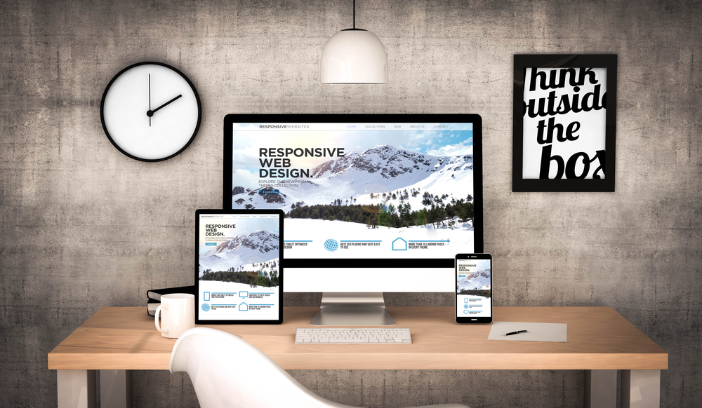
Responsive Design 
Modern website layout and design includes responsive design. Your website must respond to the device on which it is being viewed, conforming to size and shape requirements so that elements are displayed in the proper proportions, rather than being stretched or otherwise distorted.
You don’t want content to be so small it is impossible to read, or so large that users must scroll side to side, as well as up and down, just to view it. By using the right tools in CSS Grid, you can ensure that your content displays correctly no matter what devices or browsers users view it with.
Honing Your Layout and Design
When you find new tools that allow you to explore a vast array of creative options, it’s easy to go overboard and end up with something that’s not so much innovative as outlandish. Don’t forget, you still need to appeal to an audience and create an intuitive user experience that represents your brand.
For this reason, it’s wise to work with seasoned professionals that have the diverse skillset needed to shape your message and your brand requirements into a streamlined virtual portal to interact with consumers. When you’re ready to revamp your website, contact the experts at Storypowered at 828-450-2551 or contact us to get started.