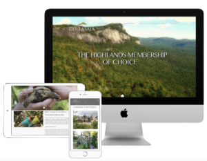
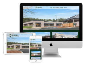
 Without a reliable and experienced Asheville branding and marketing partner to guide you through modern web design, SEO, and social media management, you could find yourself struggling to set and reach attainable goals with your online strategy. One of the biggest mistakes many B2B operations make is paying little to no attention to how prospective clients react to and interact with their website.
Bad website design can cause all kinds of problems. For starters, it makes a bad impression with visitors. Suppose you had a brick and mortar store where no one greeted guests or helped them to complete purchases, it was unclear how to find product information, and the store was laid out in a way that confused anyone walking in. Your store would fail, and fast.
The same basic principle applies to your website. Poor design can impact organic traffic, lead to high bounce rates, and turn off even loyal customers. Your marketing, branding, and SEO efforts will all be for naught if the final destination turns out to be an impenetrable maze that ultimately leads clients straight to your competitors. With comprehensive coordination from a talented Asheville internet marketing agency, you can avoid the most common mistakes with B2B web design.
Lack of Relevant Information
When visitors reach your website, there’s a good chance they’re looking for something specific. If your marketing efforts with your branding services agency are on point, visitors will reach a landing page where they’ll find exactly what they’re seeking. Alternately, they may reach your home page, where they should find a pathway to the information they seek.
A sitemap (a navigation bar or hamburger menu) should be immediately visible, on prominent display at the top of the page, along with a search feature. If visitors don’t find what they want on the first page they land on, you have to provide them with a quick means of reaching their preferred destination. Information is what businesses are seeking when they visit your website, and you want to make sure you provide it post haste or at least give them an easy way to find it.
Clunky or Less Than Intuitive Navigation
 Providing instant access to the most important information (what you do and what you offer) is important, but you also need to consider how visitors navigate your site. You want to make their experience with your brand as pain-free as possible, and this means helping them find what they’re looking for with minimal hassle.
In other words, you want to help them reach the information they seek in the fewest steps. You and your marketing firm should work to create navigation that is simple, straightforward, and consistent so that users intuitively understand how to use it.
From a practical standpoint, you also need to consider details like the sizing and color of navigational elements like menus, buttons, and so on. Do they contrast with the background so that users can quickly identify them? Are they sized to catch attention and displayed at standard locations like the top corners of the page or at the bottom of content? Are all of your internal links in good working order, or are some broken while others lead to the wrong pages?
Information and navigation are easily the most important aspects of your B2B web design, and they are the two areas where mistakes are most commonly made, so go the extra mile with your branding services agency to ensure relevant content that resonates with visitors and clear navigation that lends expected convenience to the experience.
Unrefined Branding, Cluttered Layouts, and Delays
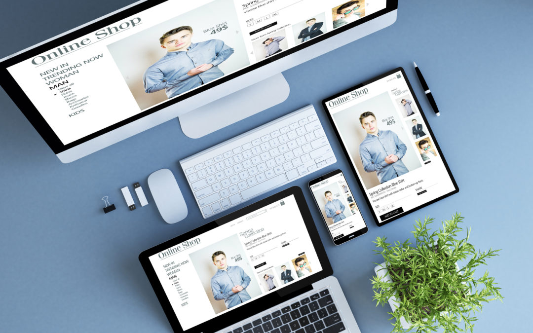
These may sound like different issues, but they’re all part of the same problem – wasting your client’s time. Whether visitors to your website encounter confusing brand messaging, they have to wade through a lot of visual and content clutter to find what they’re looking for, or they encounter lagging load times and pages that aren’t responsive (i.e. load incorrectly for mobile browsing), you’re holding them up.
This is a problem for two reasons. First, expectations for website functionality are high in this day and age. You have only a few seconds to wow website visitors before they get antsy and navigate away, probably never to return. In addition, you want to impress prospective clients, and making them wait is not the best way to set the tone.
Suppose you entered a store, ready to make a purchase, and the cashier ignored you while taking a phone call. After a few minutes, you’d leave in frustration, with a negative impression of the store. Your website visitors will feel the same way if your pages don’t welcome them and provide immediate solutions to the problems that led them to you in the first place.
With the right Asheville internet marketing and online management team by your side, you can avoid the most common B2B web design problems, make a great first impression, and reach your goals for traffic and conversions. Contact the experts at Storypowered today at 828-450-2551 or online to learn more.
