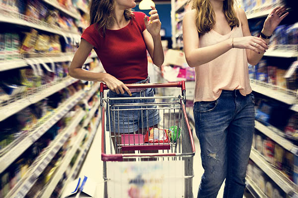
All you have to do is walk into a grocery store to understand the significant hurdles consumers face when it comes to choosing the best products. Rows upon rows of bright packages draw the eye and scream for attention, and consumers must try to differentiate, find the features they prefer, and make a choice about the brands and products that best serve their needs – and that’s all for a $5 box of cereal. The stakes are much higher when the prices go up.
With the right packaging, you can do a lot to convince customers to support your brand and your products over competitors. Naturally, your packaging must convey what you have to offer via images and text. The question of psychology in sales enters the picture when you start to consider how that content should be presented and laid out for optimal effect.
If you and your branding services agency want your products to fly off the shelves, you really need to put some thought into how consumers approach the purchasing process and what your packaging does to catch and hold attention and deliver appropriate messaging. What are the colors, dimensions, and even the font and feel of your packaging doing to promote your branding and encourage sales? Here’s what you and your Asheville branding and marketing partner need to discuss.
Branding with Color Psychology
 Most of us have a basic understanding of color psychology, even if we don’t think about it much. There’s a reason stop signs are red, for example. Would we be as likely to see and respond to them if they were gray or camouflage colors? Probably not.
Aside from merely grabbing our attention, however, we tend to associate certain colors with certain emotions or even involuntary physical responses. Coke, Target, and Netflix are all distinguishable by their bright red logos. Why? The color red has been shown to create certain reactions in onlookers, including a sense of urgency and feelings of hunger. Both can be used to encourage impulse buying and create feelings of excitement.
Yellow may elicit feelings of optimism and joy, which is perhaps why McDonald’s favors golden arches. Blue is associated with trust and safety and is known to have a calming effect. Maybe this is why so many brands, including Facebook, Ford, Visa, and more have chosen blue as their signature branding and marketing color. Picking the right colors to represent your brand and your products is essential to encouraging sales and besting competitors, so it’s an important point to discuss with your branding services agency.
Marketing through Shapes
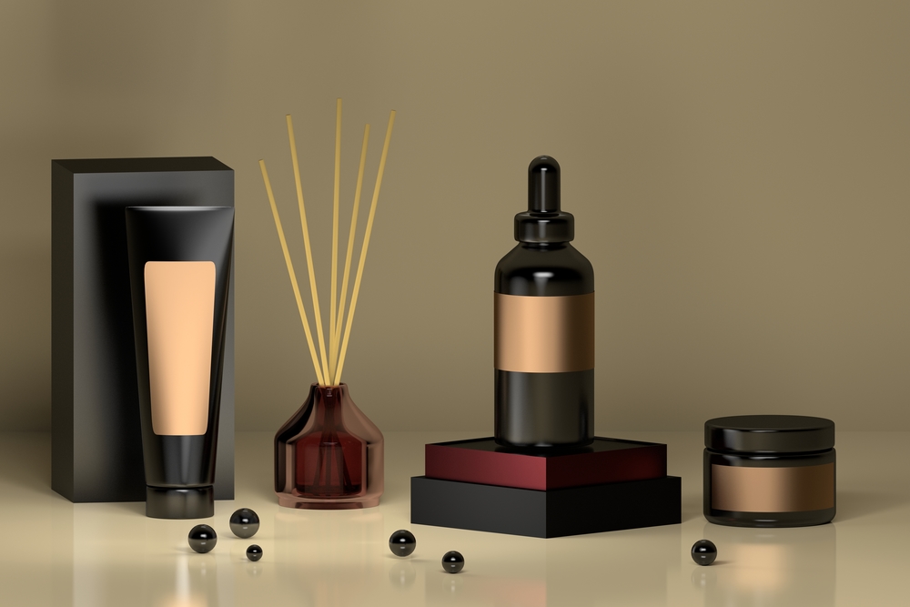
Believe it or not, the shape and configuration of your packaging can also have a psychological effect on consumers. While many businesses elect to utilize standard structures and shapes for product packaging (a simple square or rectangle, for example), and this choice could reduce production and even shipping costs, you have the opportunity to really differentiate your products from competitors by utilizing interesting and attractive shapes and structures for your packaging.
Did you know that people tend to associate curvilinear forms with beauty, and that these shapes actually activate regions of the brain associated with emotional impact and reward? So, if you’re looking at a square bottle versus a curved one, guess which one you’re likely to reach for? Understanding how shapes and configurations affect shoppers could help you to differentiate your brand and your products in positive ways that enhance sales.
A Veritable Font of Information
You might not think the fonts you choose for your company logo or packaging will have a huge psychological impact on shoppers, but every detail counts, as your marketing partner can tell you. On a very basic level, you want fonts that are easy to read, which in print means choosing serif fonts (versus sans serif, which tends to look better in digital formats). In addition, you need to choose colors that are highly visible against the background, so your messaging is prominent.
From there, you need to consider what other information your font conveys to customers. A curvy script may denote luxury or whimsy while simple, straight lines might be more associated with power and directness. You can choose traditional versus modern fonts, playful versus authoritative fonts, and so on. The point is, your font says a lot more than the words it represents.
Moving Beyond Images with Asheville Branding and Marketing Experts
 Your marketing firm is primarily concerned with images because the online arena is a visual medium. When it comes to packaging, however, you have to focus on tactile sensations as much as visual elements. What does your packaging feel like and how does that influence shoppers who grab your products? Think about what textures appeal to people and beg to be touched, as well as what the right texture can add to the shopping experience and the understanding of your products in general.
With a partner like Storypowered helping to craft the consumer experience with proper branding and marketing, you have the opportunity to use consumer psychology to your advantage to move products off shelves in a hurry.